V8id
Title/login screen
Sometimes I really don't feel like coding at all. In those hard times, it's very useful that I have a LOTS of things to do... A huge amount of things that are NOT related to coding 😄
So today I decided to make a title screen for the V8id client. Or a login screen, if you wish.
Initially I thought it can't be so hard, because I already have my half baked tileset, it should be enough for starting something. Yea, it was enough, for "something", but it was really far from good. Or acceptable. 😣
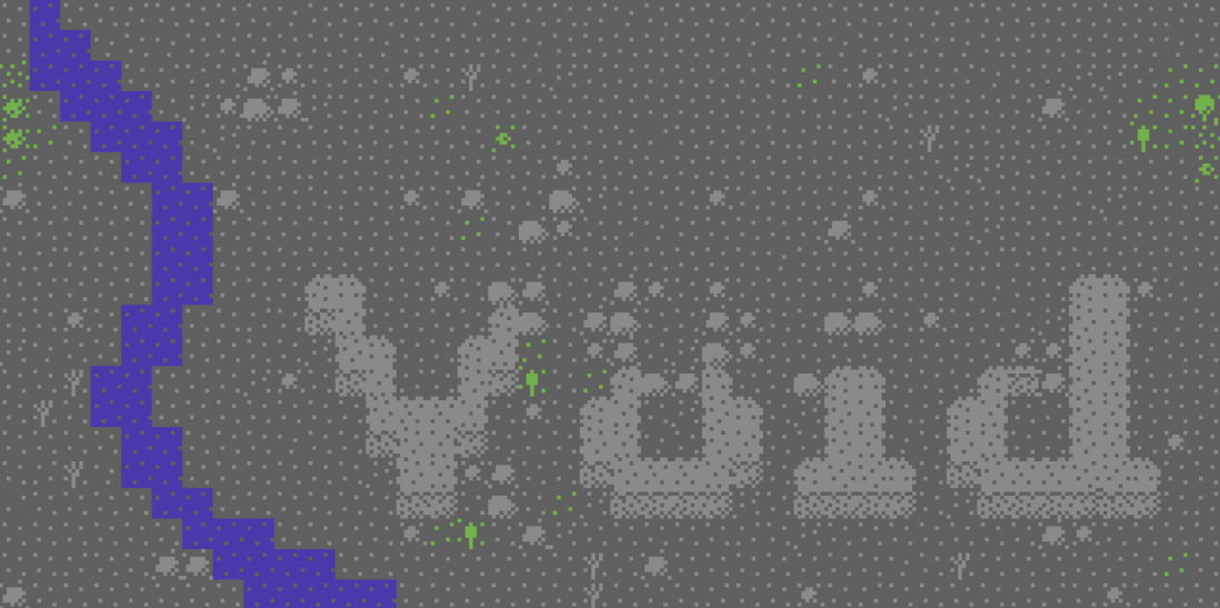
At the first attempt, I think I've successfully made the perfect text for the logo.
It was a decision that the top part of the "o" should be less prominent than the other. It should "suggest" only that there is an "8" there. Our main message is the word "Void" but mixed with an 8 bit passion. This is why I choosed this strange name at a random moment when I realized the simple Void is so meaningless, mediocre and powerless. Yes, it describes the world, and the emptiness but it doesn't have that unique vibe.
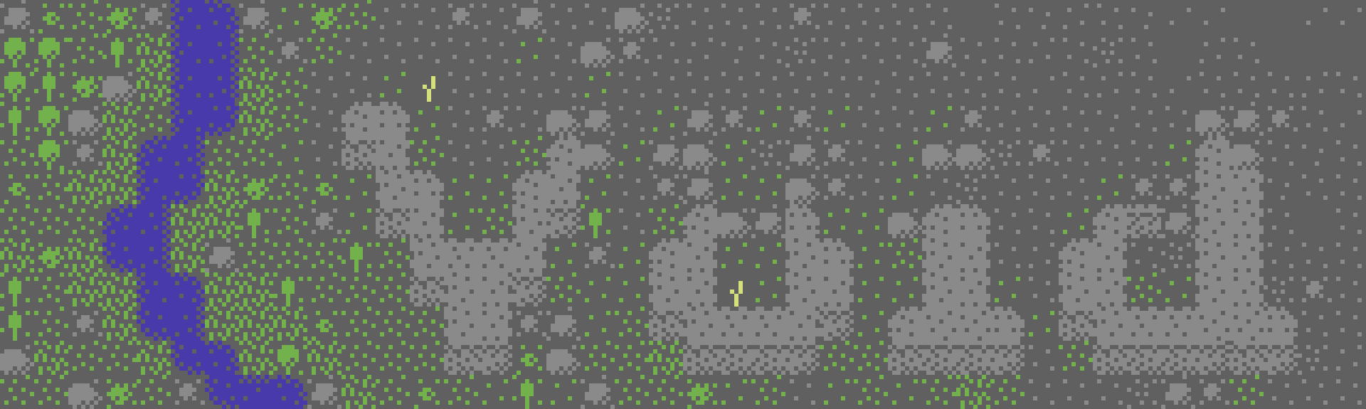
Ok, so that's enough about the logo. Let's see the "river". Hm... I need something more on the screen than just some rocks. And I have only trees and water now. (And some ugly looking wall tiles, what I didn't want to use. Also the path/road tiles are looking like sh*t 😐️)
The big blue line really cuts the whole picture in half. As you can see, I'm really not a designer, so I was struggling a lot. I know about the golden ratio in images, so this is why I thought initially, that I should have something on the 1/3 of image somewhere. But this is not the right way to do it. It's just distracting, and ugly. The logo is OK, but it doesn't have that living vibe. I have to spice it up somehow. It's fading into the background. Complete garbage.
Ok, it's time to learn something from the internet people. 😎 About proportions, contrasts, guiding the eyes, etc, etc.
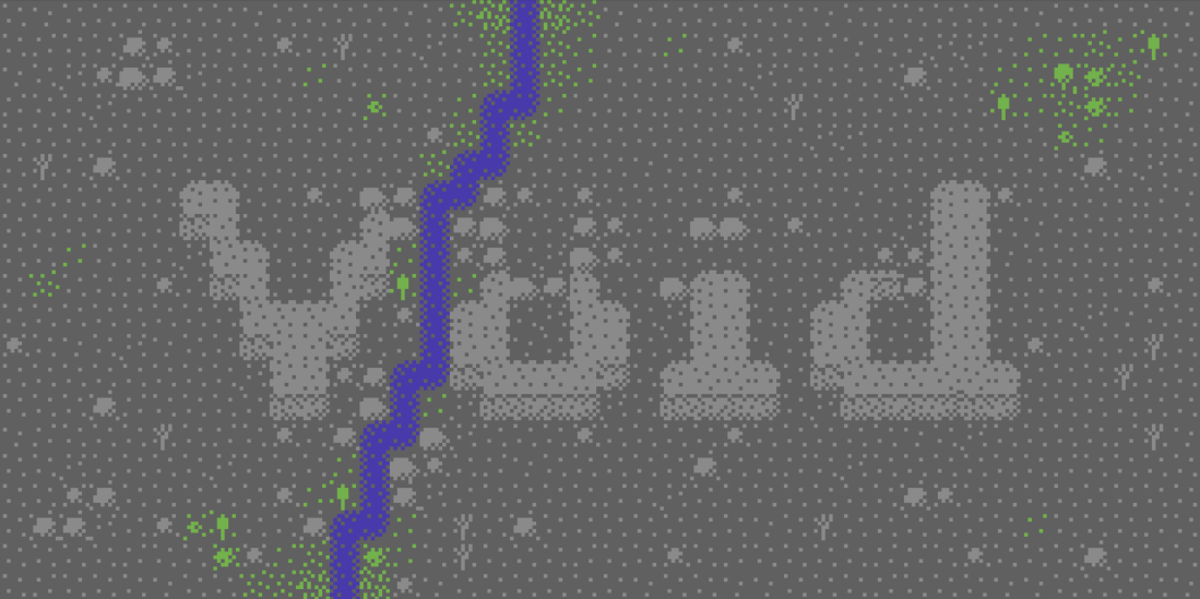
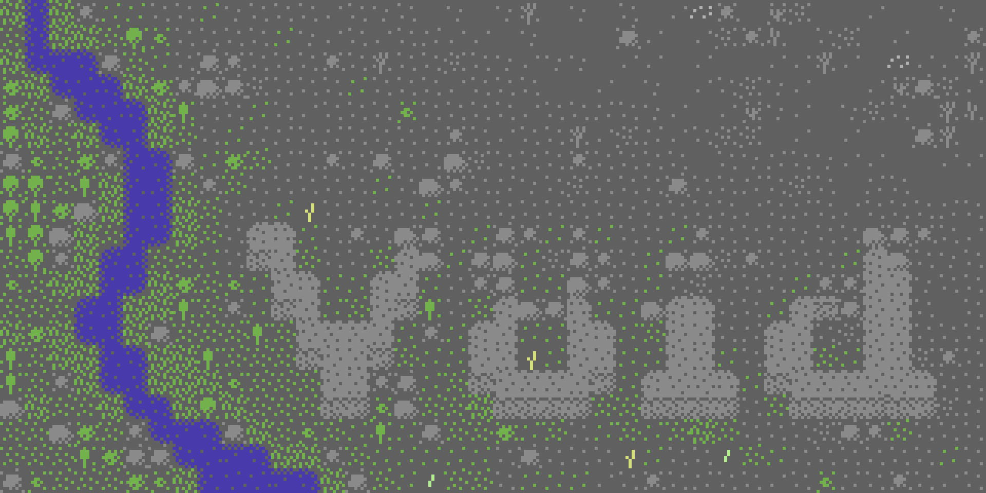
Looks better. 1/3 river + 2/3 logo. I also tried to move the logo down a bit to break the mathematical symmetry. It feels somewhat natural. Not perfect, but this will be the right path. The river still looks too arcificial and mechanic. Need to redraw...
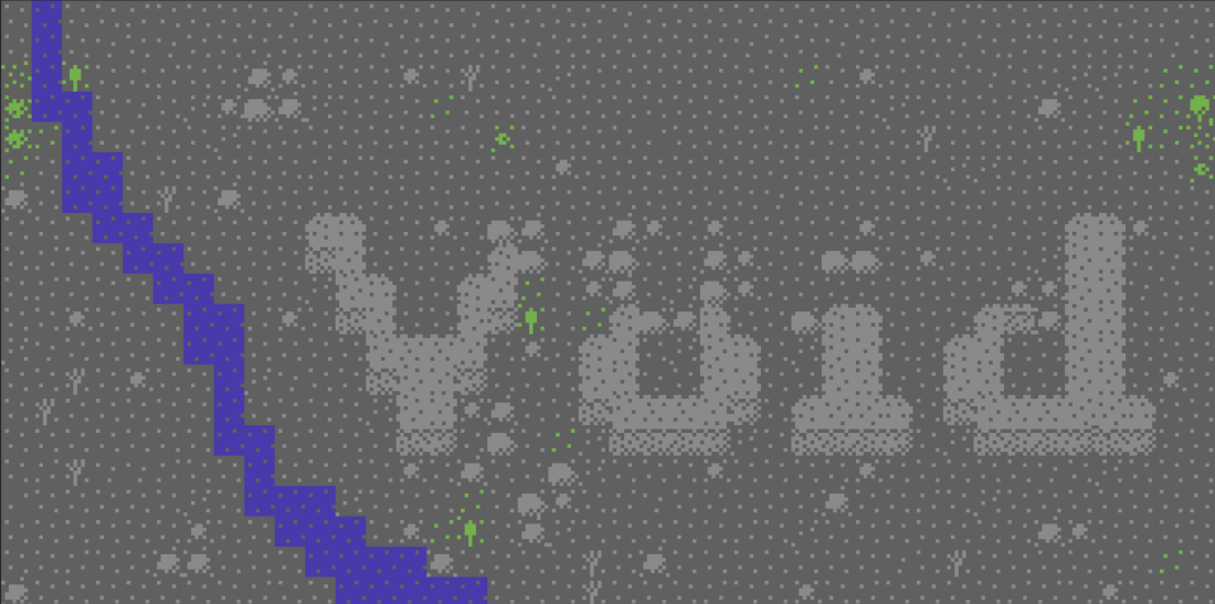
Oooh, a snake-y little river! Feels more natural. But still looks somewhat weird. I played with the exact shapes a bit, and finally decided to try out a wider lane.
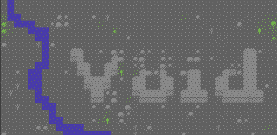
Wow, it looks more smoother, and now the water has some kind of "flow", it directs your eyes from top-left through the bottom. I also moved the logo down a bit, it was still too close to the center vertically. I was really satisfied with the positions of the things.
Now comes the other part: details. I need to visually tell my story. Guide the viewer's eye from top left to bottom, then right through the logo.My evil plan is to have dense "life" at the left, and make a gradual emptiness while we are going to right. Also if I can surround the logo, or part of it with grass, bushes, etc, then it will help to highlight the letters.
And that's all. It was supereasy, wasn't it? (No, it took my whole afternoon 😄) It's far from perfect, but I think it's not so bad for the first shot. There is always room for improvement, right?
I'm somewhat impressed. Not about my great graphical and designer skills, but about how much you can do with only this limited amount of resources. A few colors, a few type of tiles, and some tricks about where to put things. ("I am putting my screwdriver everywhere", if you know what I mean 😉)
We also have some dead plants at the top right corner. Isn't that fantastic?
That's the essence of the V8id philosophy: everything is possible with just basic building blocks.
Just do it. 😎
Leave a comment
Log in with itch.io to leave a comment.